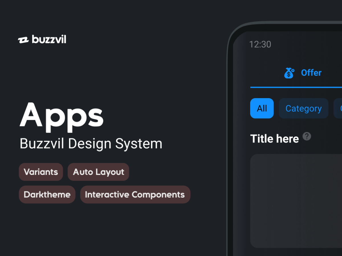
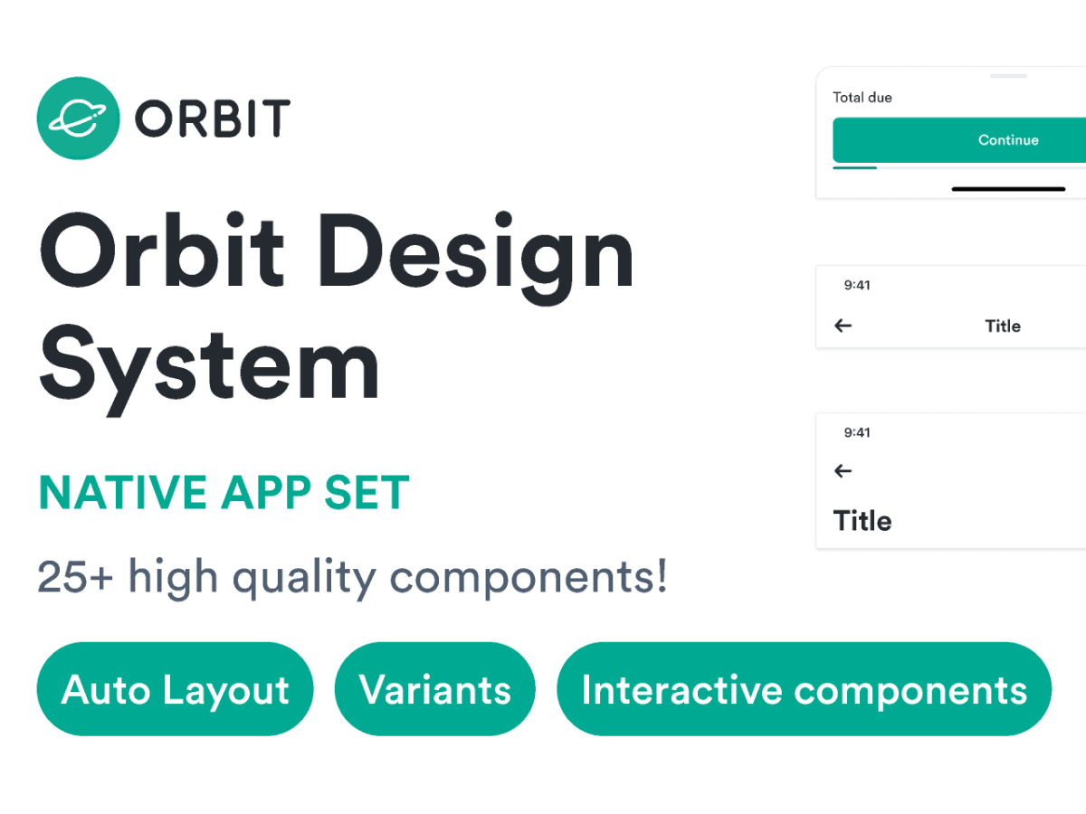
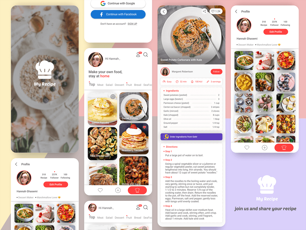
Buzzvil App UI library is Mobile only library dedicated to creating dozens of Applications for our partners. We like it very much so we decided to share it onto this amazing Figma Community! Enjoy!
👉 We got rid of all the specifics and kept all the things we thought would be helpful to others.
If you want to know more, feel free to visit our online doc:
And our Dash UI Library (manager).
Auto-layout everywhere ↔️
Everything needed is pre-built with Auto-layout. It gives a better control on editing, ordering, padding & alignment.
Auto-layout is a life savior when components start to be nested into each other.
Variants is the new black 🖤
Variants are keeping things tidy!
We keep each component structure as flat as possible so it’s easy to override properties. It also helps to keep the files light.
When we start having tons of variants for a single component, we use a nested Master component to rule’em all. 👨🎤
Dark-mode ready 🌝
We support dark mode for our entire UI library! We made it classy, but it’s fairly recent so we would appreciate any feedback on that! 🙏
Interactive components (beta users only) 👆
Pretty much most of our action components are already wired up! Just drag and drop them from the library panel and it’s already alive! We will be continuing updating this part with better support in the future. 🚀
Conventions ✨
Because things can get messy real fast, we’ve been working with clear naming conventions for consistency & readability:
On library level, a component name will be as simple and descriptive as possible (Button, Radio, Checkbox…)
On a project scope, shared components will be named by using project name: [Project]/[Component]
On a page scope, components will be named by using the page name: [Page]/[Component]
What’s inside the file
Components are divided into multiple categories that follow our Design System structure. Select a component and access the related page through the description link in the property panel.
- 👋 Hello
- 🎨 Colors
- Accordion
- Badge & Chip
- Button
- Card & Banner
- Entry
- Feedback
- Header & Footer
- Icons
- List
- Modal
- Progress
- Tab
- Texts
- Toggle
- Support UI (Android / iOS
