


 Submit
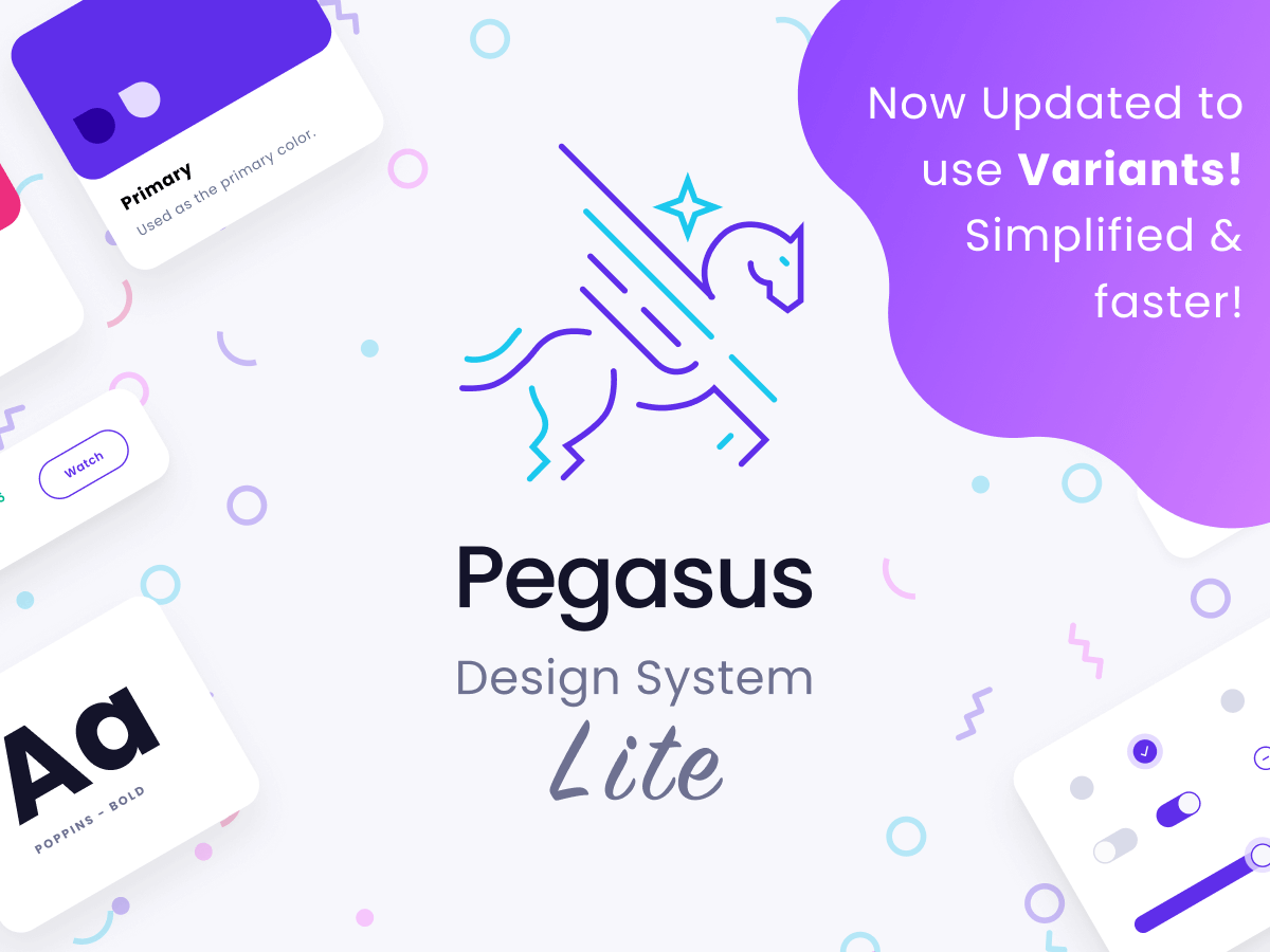
 Download Resource
Pegasus Design System is a Flexible, Consistent, and Accessible collection of atomic designed components in Figma. Built using component Variants and now reorganized to increase speed of workflow.
Summary
- 300+ Atomic Designed Components
- 72+ Royalty-Free Original Icons
- Themeable for your brand colors/fonts etc.
- Different Sized Components
- Full-Form Building Buttons, Text and Custom Inputs
- Desktop, Mobile Web, and Native Patterns
- Responsive, Desktop, Tablet, and Mobile Grids
- Base8 Sized for Pixel Perfect App Designs
Branding
- Colors, Typography
- Styles, Effects
- Icon-set
- Spacing, Photography, Grid System
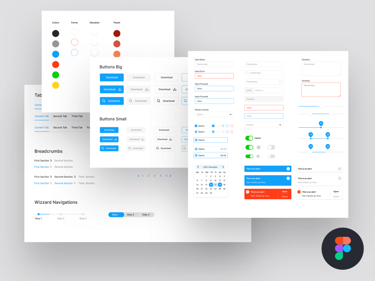
Components
- Buttons, Text Inputs, Checkboxes, Radios, Checkboxes, Toggles, Sliders, Increment Stepper
- Pagination, Progress Indicator, Avatars, Badges, Dropdown’s
- Accordions, Tables, Toast, Tooltips, Modals, Tabs


