The most flexible component library!
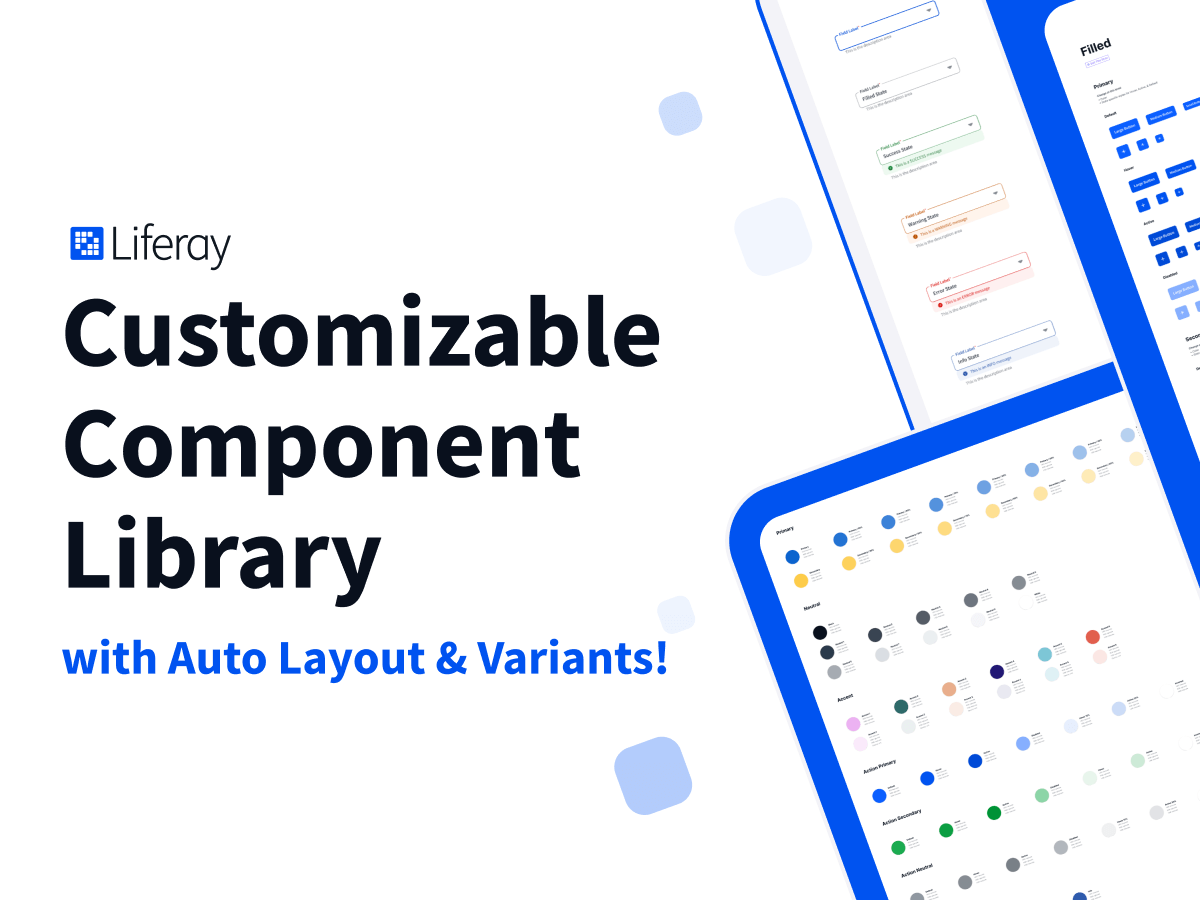
These components are ready to use out-of-the-box, however, you can always customize, restyle, and organize them for your specific needs. We made these components to be as easy to restyle as possible!
100% Free forever! 🤑
We just ❤️ Figma community.
Auto Layout Components ⚡️
We collected all the tips, tricks, and best practices to use in these components.
211 Styles 🎨
- Text
- Colors
- Placeholder images
- Drop shadows
- Layout grids
1733 Components! 🍱
…and more coming.
Yeah, it’s a lot. But we made it really easy to remove any you don’t need!
Totally Customizable 💃
Style the components however you want! Really easily!
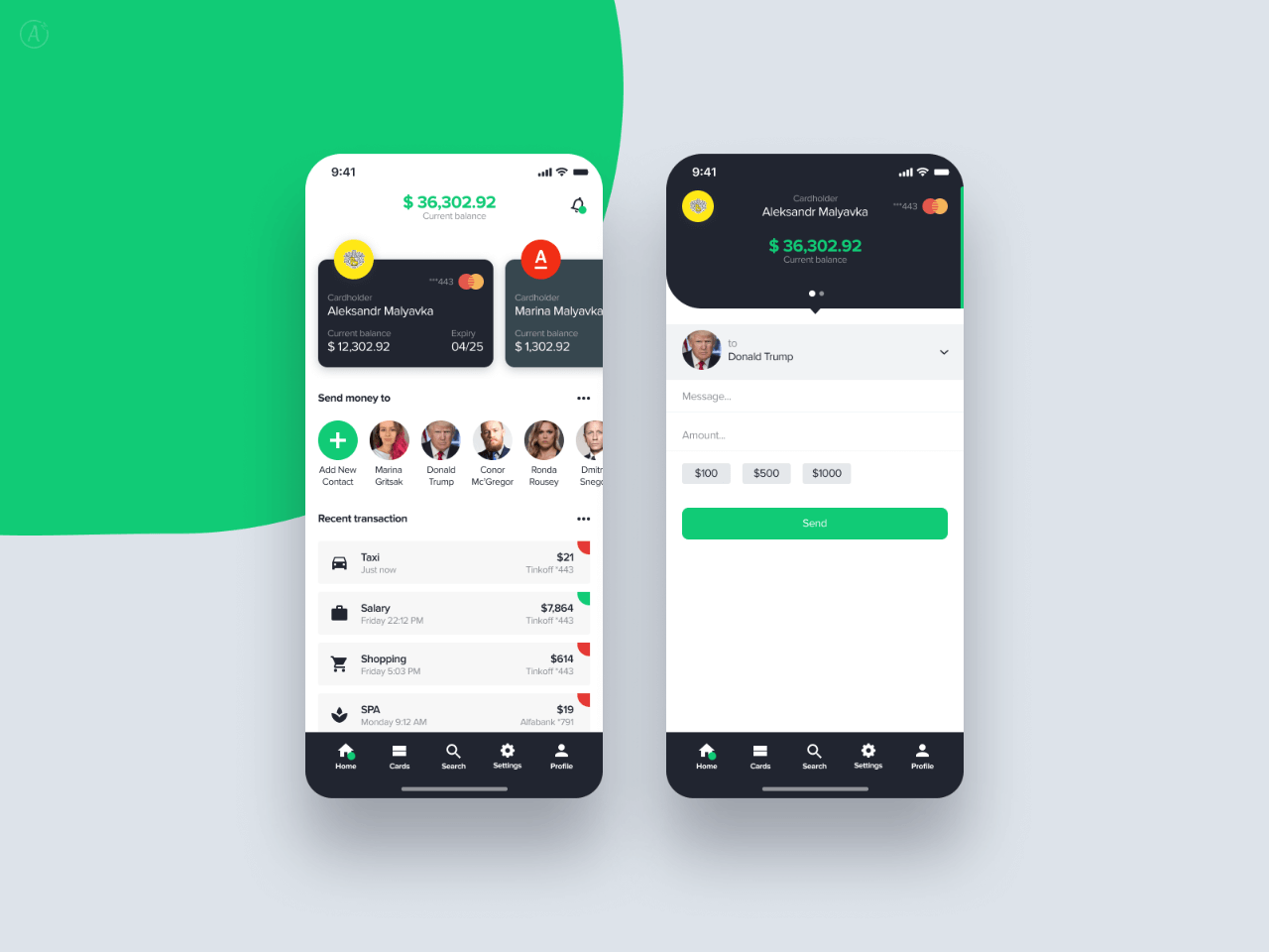
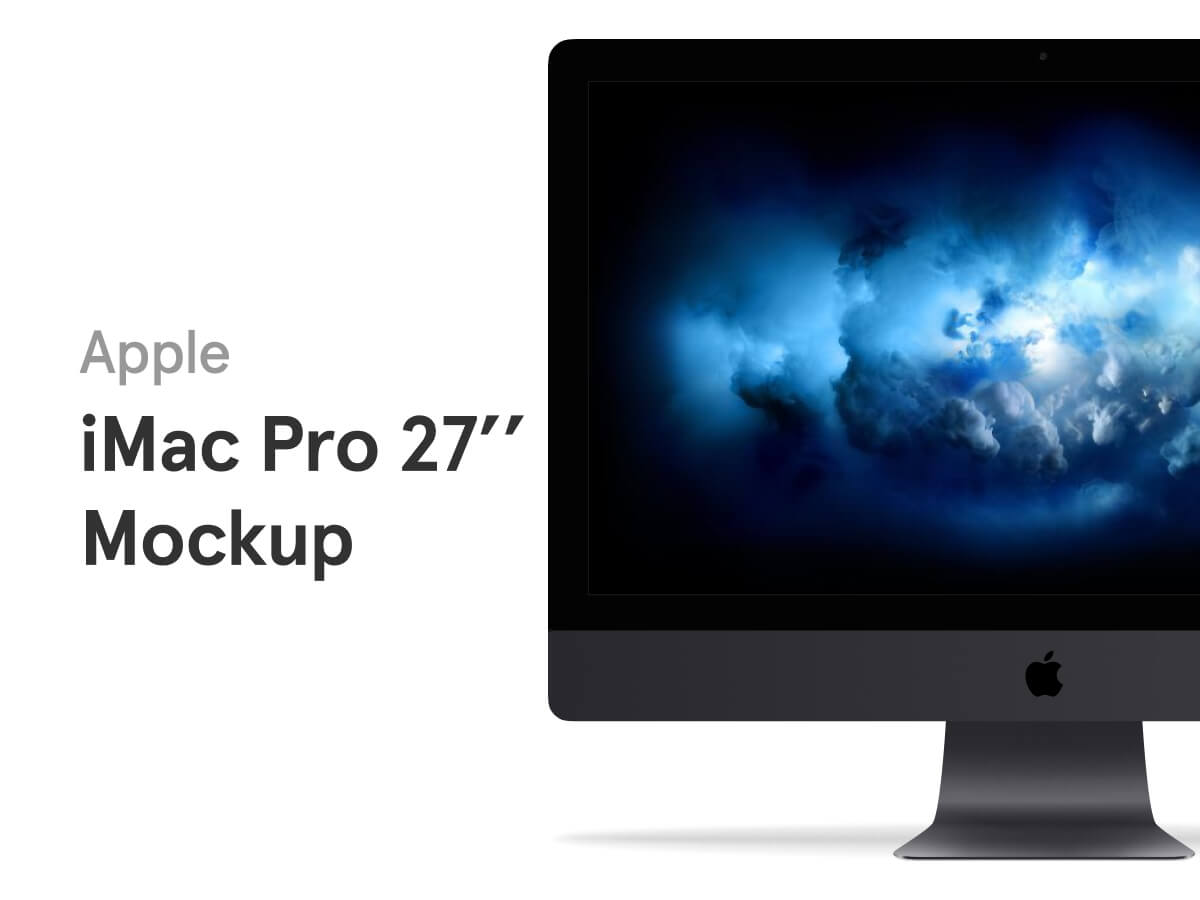
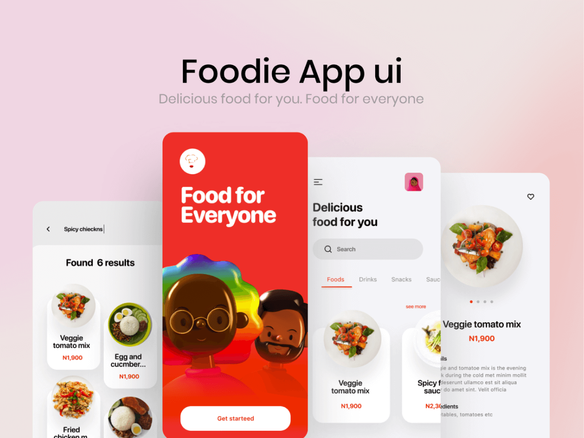
Make it look like Apple, or Google, or Dribbble, or your brand with minimal effort.
Really Well Documented 🤓
We made it easy to get familiar with the library!
- Helpful plugins & tips
- Step-by-step guides
- Component architecture diagrams
Component List (so far…)
Styles
- Typography
- Elevation
- Color
- Layout Grid
Components
- Alerts
- Avatars
- Buttons
- Cards
- Checkboxes
- Chips
- Dividers
- Dropdowns
- Dropdown Menus
- Icons (Material)
- Input Messages
- Links
- Modals
- Navigation
- Notification Indicators
- Radios
- Search
- Sliders
- Status
- Tables
- Tabs
- Tags
- Textareas
- Text Inputs
- Toggles
- Tooltips
- Utilities


